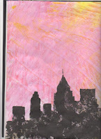
We were asked to bring in an old credit card of some sort for this weeks work. This was then cut up and used to create exciting wallpaper paste ends which could in turn be used within our sketch book and other work. For example the first wallpaper paste end that I crated i am using for this module journals background. Other wallpaper past ends that i created were put into my sketch book and i played with using ink on them in some way. my best can be seen above.
Search This Blog
Tuesday, 5 January 2016
Repeat pattern with text
After creating a repeat pattern with my mono print we were also asked to create one with one of our crushed text that we had drawn last week. Therefore i took this piece, Nutella, drawing as i felt it was my best and scanned it into Photoshop. This in turn allowed me to get rid of the white background and increased the levels to create some contrast. I then copied and pasted it to create a spiral like effect which i feel worked well.
Texture, Pattern and Surface techniques
When we were experimenting with textures and patterns along with surface techniques I created a mono print of a leaf. The stages can be seen below. I started by drawing a simple leaf. I then used the mono printing station that had been set up and this was the outcome. I then scanned this into Illustrator and got rid of any imperfections as well as live tracing it to create a defined line for the leaf. The next stage was to create a repeat pattern with it which can be seen on the end. My other attempts at texture pattern techniques can be seen below.
Crushed packaging drawings
To make a start within our sketchbooks we were giving another independent task to try out. We were asked for four pages of drawings on crushed and old packaging that we could find. Focusing on the letters and how the state of the packaging effected the font on it. My four observational drawings of crushed packaging have been scanned in from my book and shown here.
Bookbinding
After creating the vinyl lettering to go onto our books we had to learn about simple book binding methods that would help us further on into the unit. We began with the most simple binding method is called, ‘saddled stitched.’ This is where you take the cover with all the pages you want and staple them all together. My example of this can be seen below. The green booklet was put together by using this method. Another method that we used can be seen above. This was the more complicated of the two but the more professional also. We began by using an A3 cover and using the offcuts to create the slit seen in the middle on these photos.
Vinyl lettering
After creating the name with ink and then scanning it into to computer, Photoshop was used to adjust the levels to create a white background and a very black font. This was then took into illustator to remove the white background and just save the outline of the wording. The final name was chosen out of the ones I had created. This can be seen above. I then got it cut out of vinyl on the vinyl plotter on a matt black vinyl. I then stuck this onto the front of the sketch book (which will be explained next post) and the outcome of this can be seen below the computer version of my name.
Hand Lettering My name
After lasts weeks marking making with ink i felt a lot more confident about experimenting with it. So when we got set the independent task to create out name using the mark making session as a guide I loved it. I experimented with many different ideas on creating a logo type mark with my own name. I created several different ideas that could be used and then picked what i felt was the best.
Type in the Environment
During the section of word in the environment I wanted to play with the texture of the sand at the beach and due to this it lead my choice of the word texture. By cutting out 3D letters to create the word. I then went to the beach at night to create a mysterious lighting for the picture, and took many pictures in different layouts and angles. I also messed the sand beneath the letters to create the texture within the photo. The editing process included changing the levels and contrast of the photo to really bring out the word. I also messed the sand beneath the letters to create the texture within the photo. The best photo was chosen and taken into Photoshop to edit. The editing process included changing the levels and contrast of the photo to really bring out the word.
Mark making
When we were going through the mark making process we used a variety of instruments to create different textures and thickness’ of the ink. This allowed a lot of experimentation to be done through out the day. The aim of all this experimentation was to get the hang of not being perfect but creating something different. Different is good.
Word associated with ‘PAPER’
All of my 26 letters were 3D due to the technique that I used, this in turn allowed me to create a very effective associated word. I feel it is effective due to the fact that the shadows are incorporated within the text which is never usually the case with fonts. I chose the world ‘Paper’ simply because it is the topic of the unit and I thought it would be fitting.
Single letter & 26 Letters
After experimenting with paper, we were then all given a designated letter or number that we had to create in a style that we had experimented with. My letter was ‘O’ and after much experimentation I decided on this technique seen below. By cutting out two of the same letter and interlocking the two to create a 3D structured letter. I then captured all the letters at a certain angle to show how the shadows fell.
Subscribe to:
Posts (Atom)